15+ Clean Website Design Examples
“Simplicity is the ultimate sophistication” —Apple
View all collections
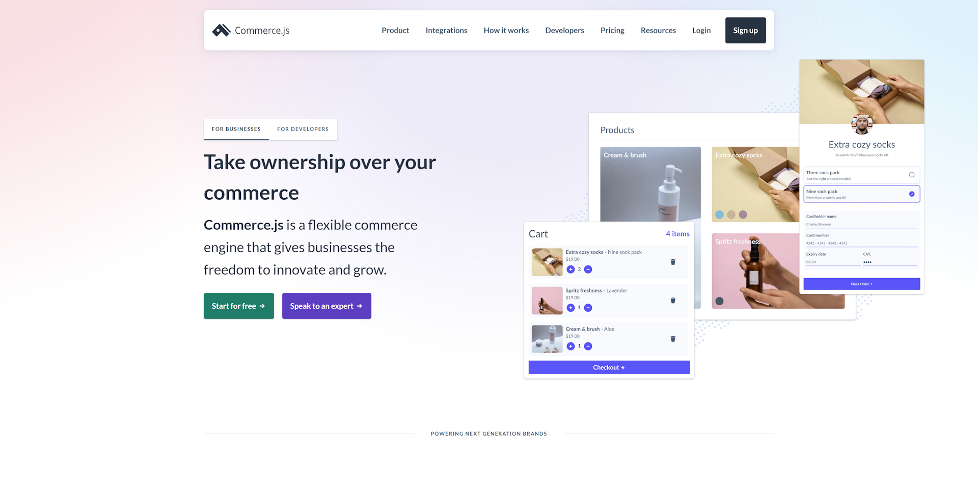
Why Commerce.js?
Subtle background gradient with multiple colours is a really modern look and helps the navigation bar pop out from the page
Styling of elements in the images is consistent with the styling of the website
Separate landing page for developers so that the home page doesn't need to be technical
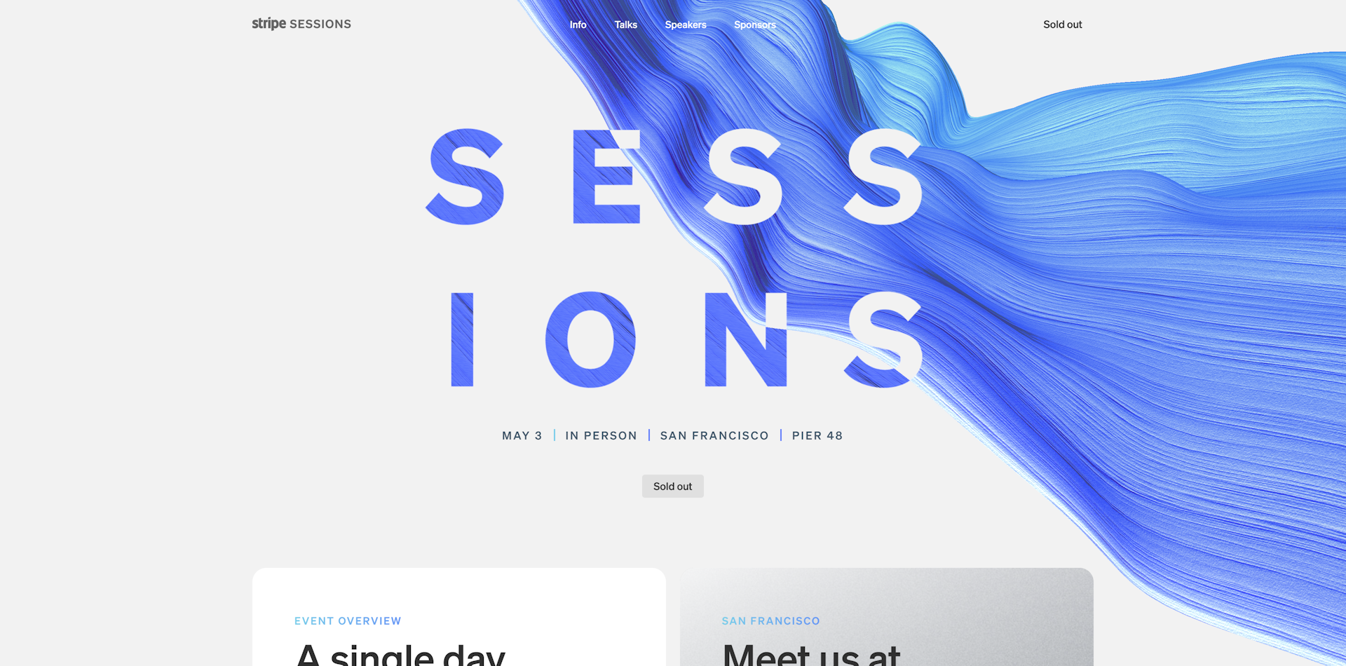
Why Stripe Sessions 2023?
The animated background blends perfectly with the text to keep it looking modern and ensure there's enough contrast
The gradients on all the text/buttons/etc shift with the animated background to keep it consistent
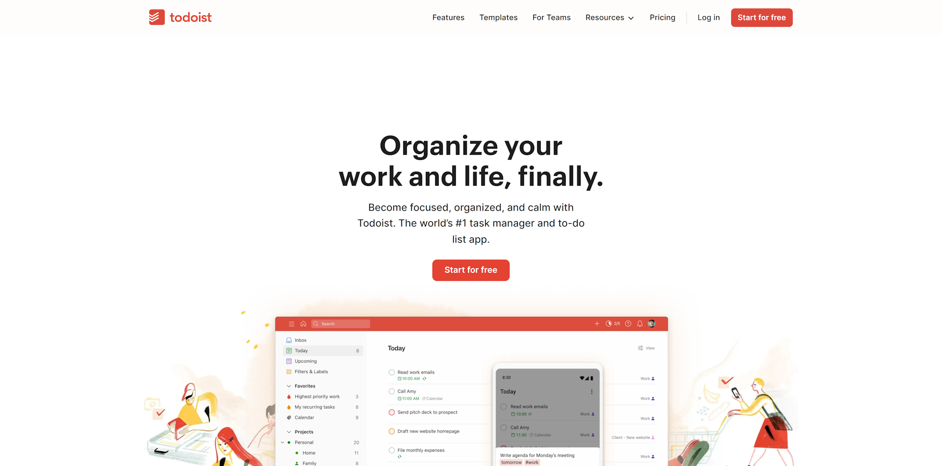
Why ToDoist?
Ample whitespace/breathing room throughout the website.
Minimal but distinct colour palette, no unnecessary usage
Unique, high-quality illustrations consistent with the overall design language that don’t make the page feel cluttered
Very straightforward page structure and navigation
Layouts allow for focus on the copy
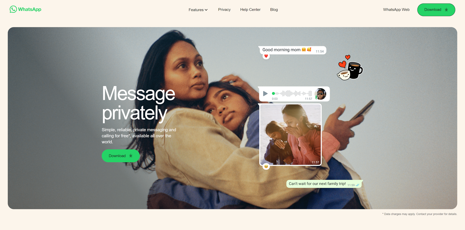
Why WhatsApp?
Rounded space around the hero section gives a really clean, modern feel
Every section focuses on one idea to communicate while giving elements lots of breathing room
Images throughout the site are full of people which automatically creates a sense of connection
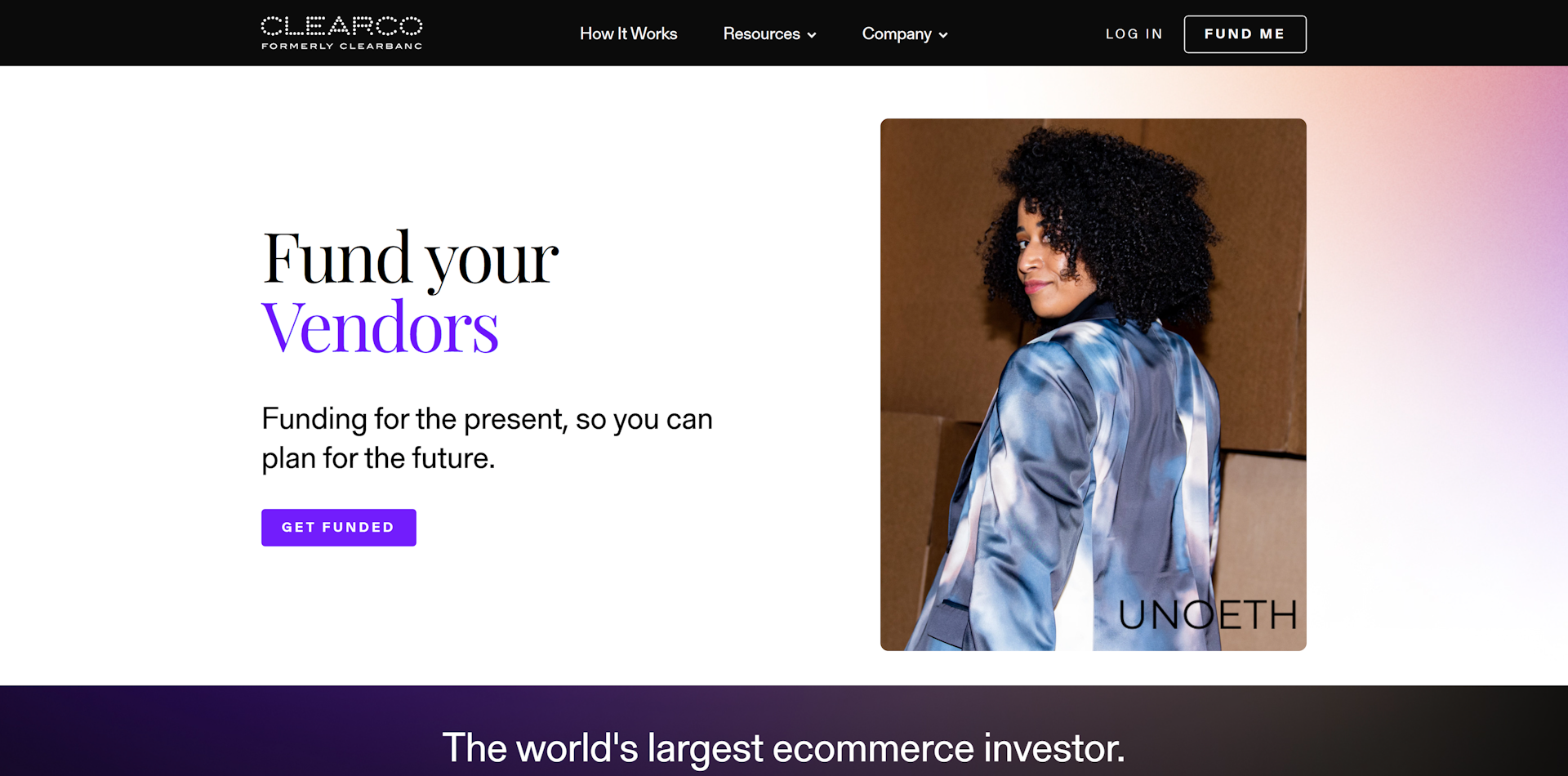
Why Clearco?
Subtle gradients with complimenting colours add to the distinctness of the design language without adding complexity
Minimal use of the primary colour so that it stands out more when used
Separating sections by background colour creates distinct boundaries while keeping it clean
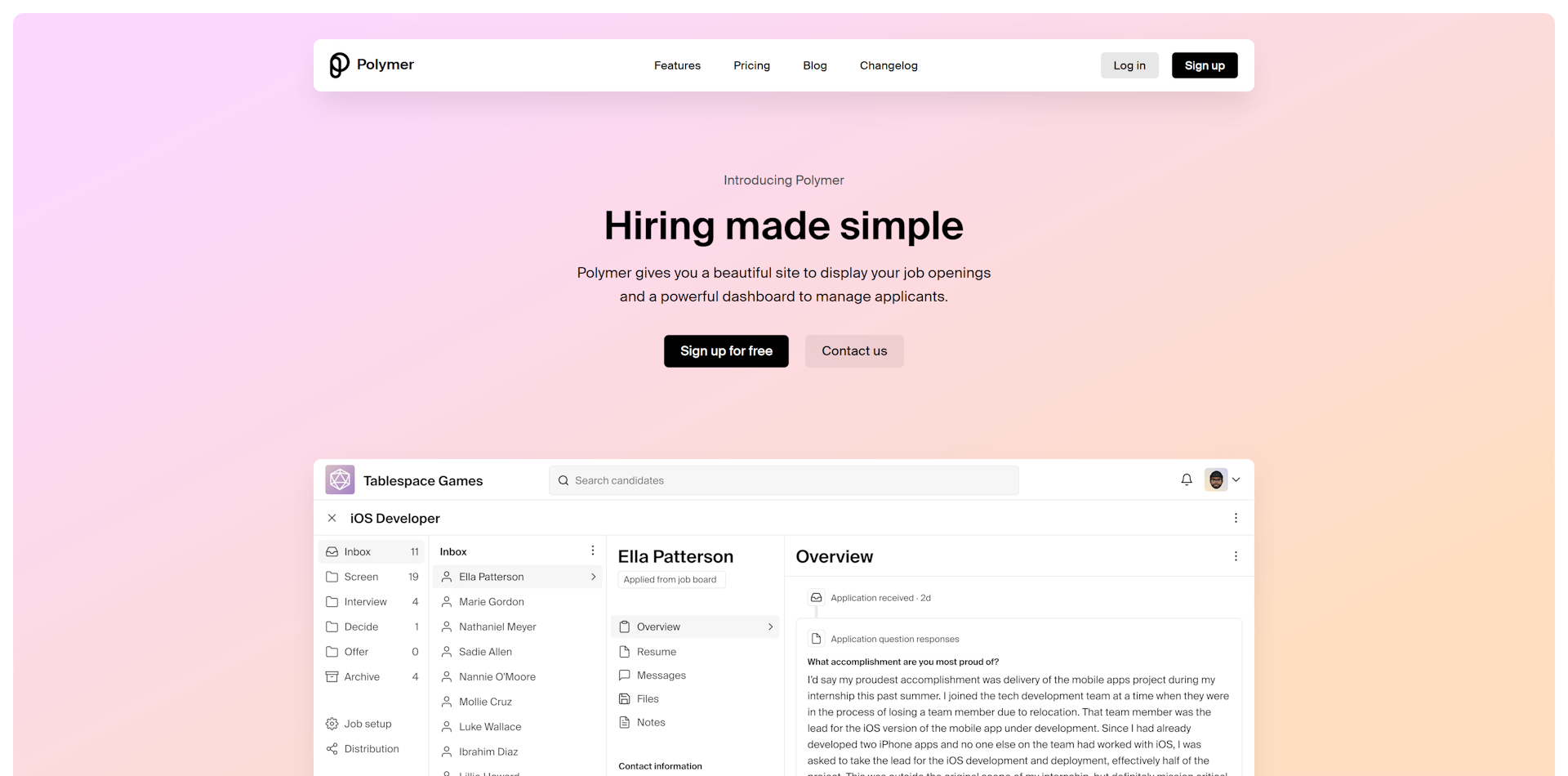
Why Polymer?
A combination of smaller font-sized in the hero section and lots of negative space call attention to the primary elements without needing to be big & bold
The spacing around all the sections instead of making them full-width adds some breathing room as well as gives more of a modern feel
Consistent text hierarchy
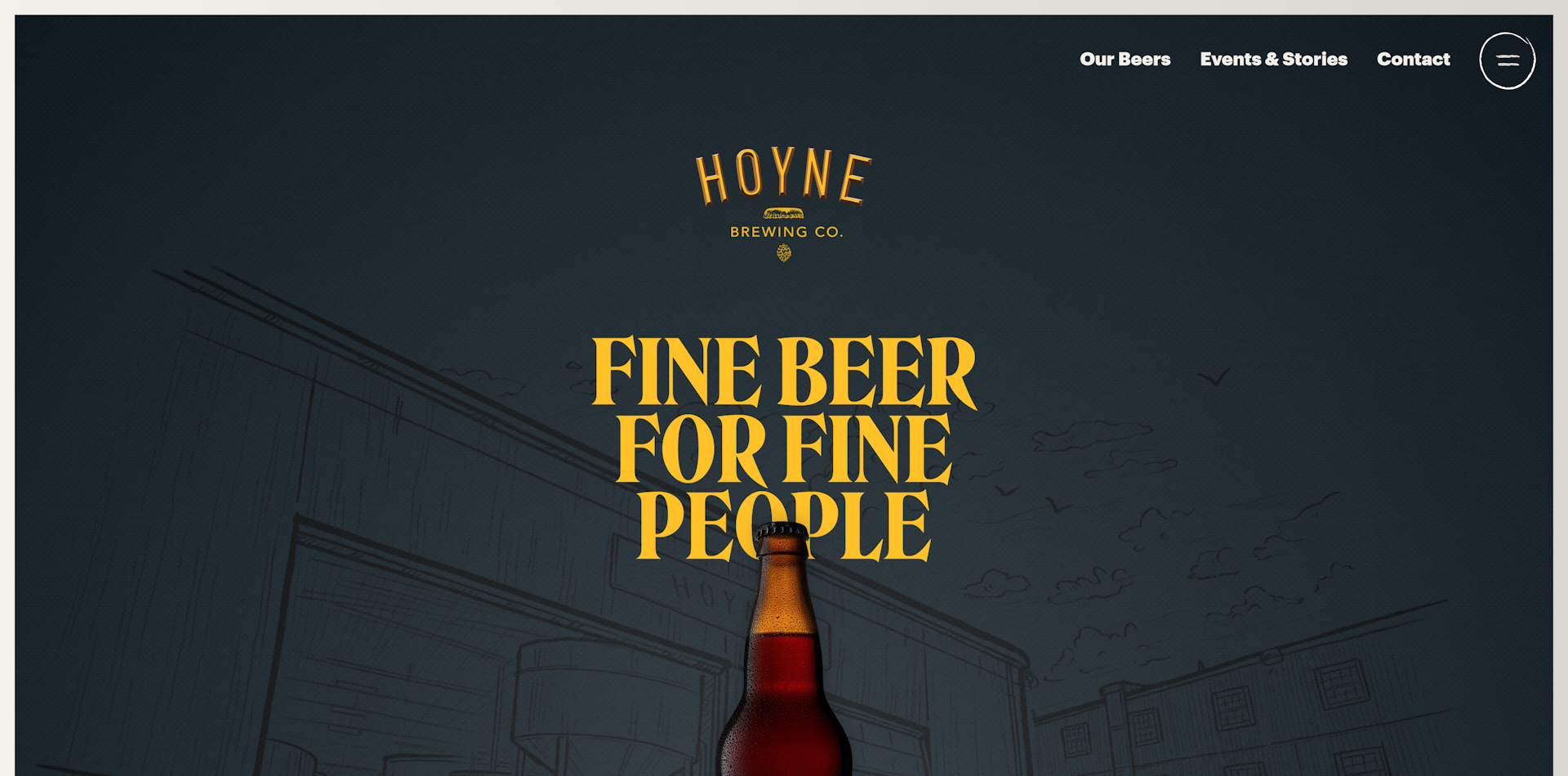
Why Hoyne Brewing Co.?
Type and imagery working together in perfect harmony
The layouts let the images and copy shine to tell the story of their business and product
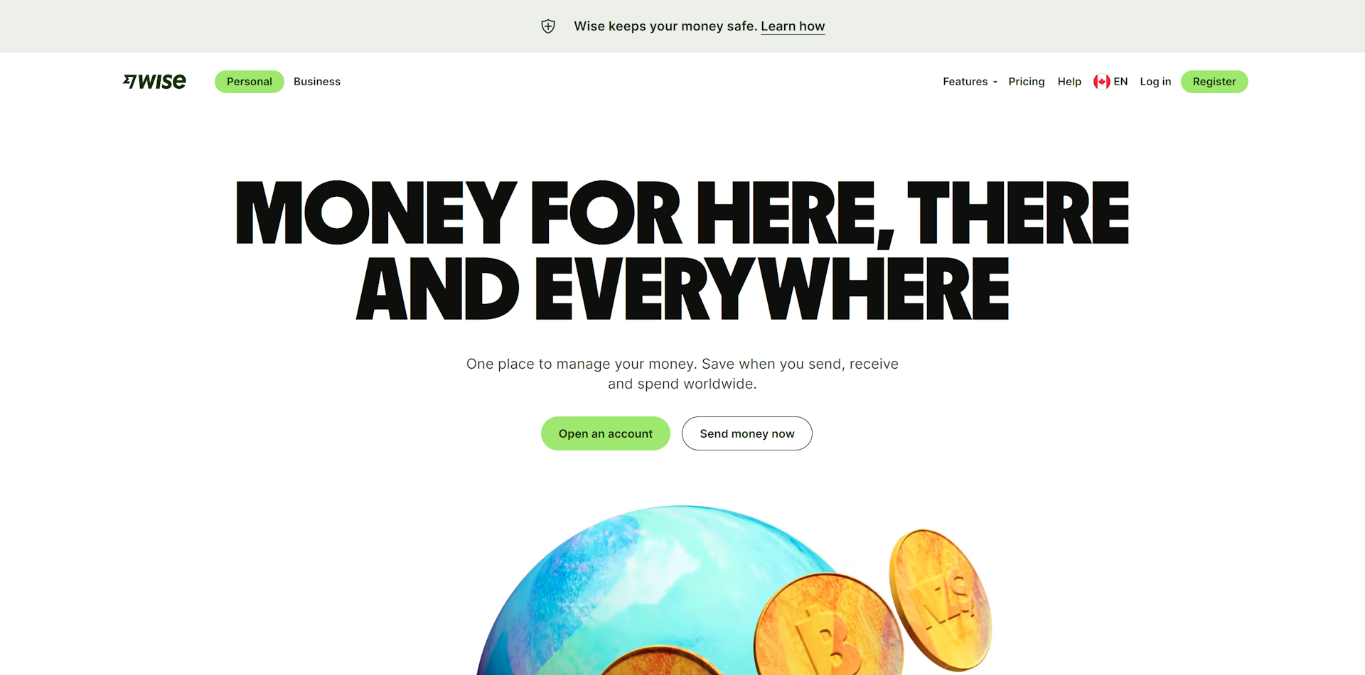
Why Wise?
Huge, strong type that immediately focuses all attention
Bold use of their new brand colour without it being overwhelming
Lots of big high-quality images that are consistent with their bold design language and help communicate ideas to visitors
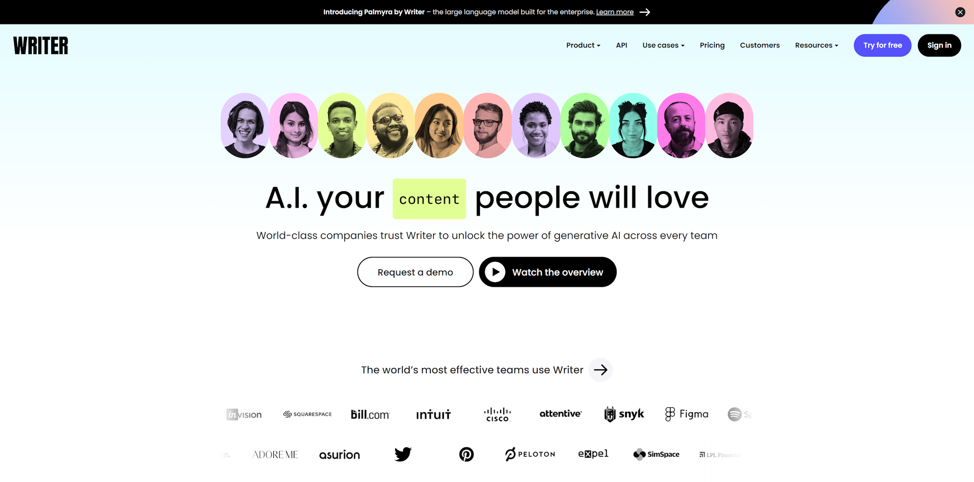
Why Writer?
Instead of limiting to one primary colour, an array of bright colours are used throughout the website to call attention to primary elements
The same colours are used throughout images and gradients; makes everything more cohesive
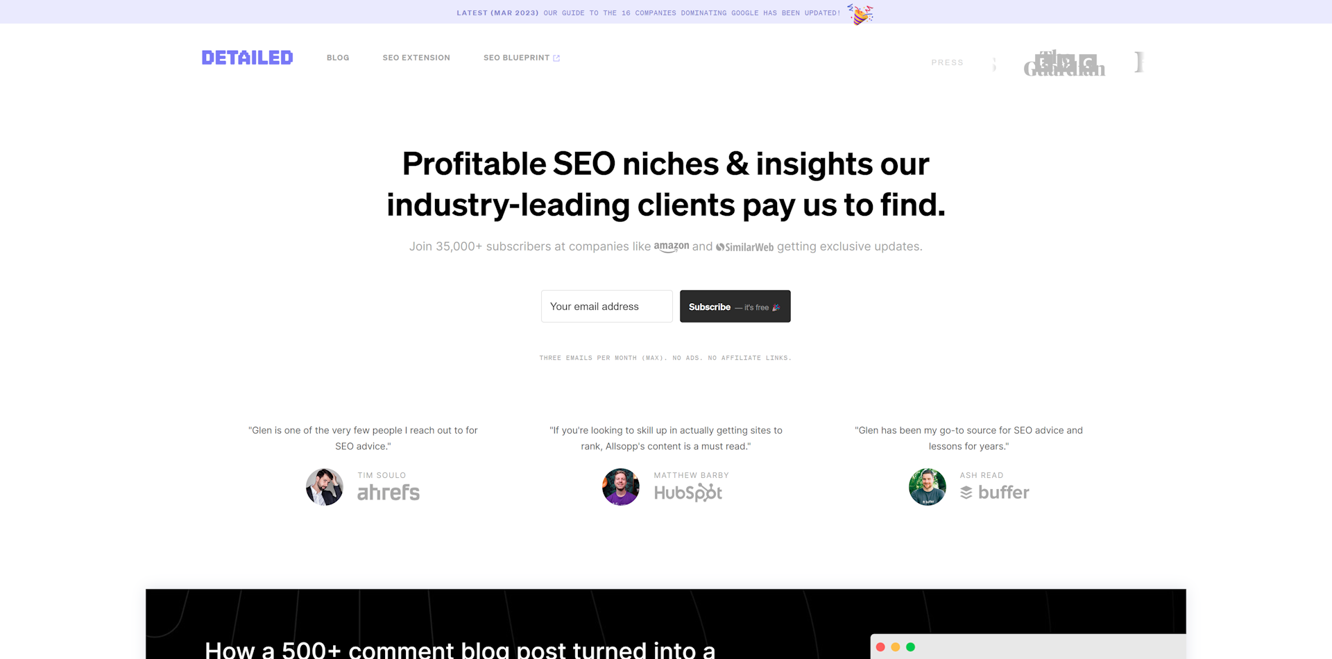
Why Detailed?
Carefully manages a content heavy layout by maintaining good hierarchy without elements competing for attention
Everything you need to understand what they do, how it can benefit you, and if it's legit, is available above the fold.
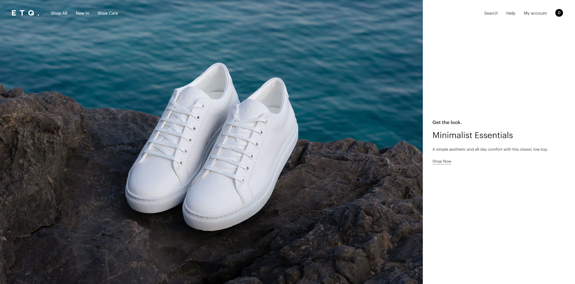
Why ETQ?
Minimal design aesthetic aligns with their brand
No fluff anywhere, their whole site is incredibly practical
Images throughout the site are minimal and fit with the overall design
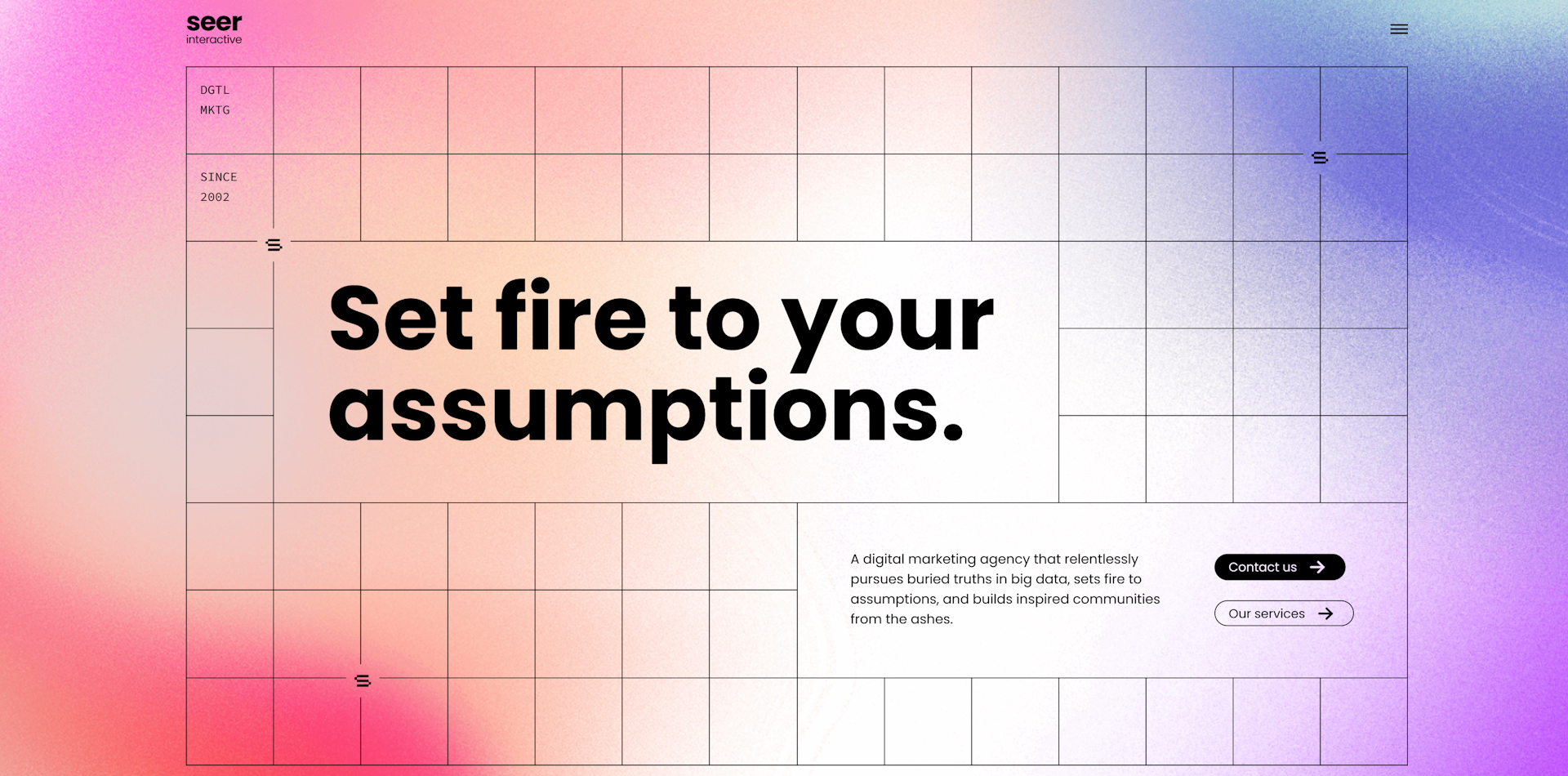
Why Seer Interactive?
Their design is all about clean thin lines with colorful gradients which makes for a really cool and unique look
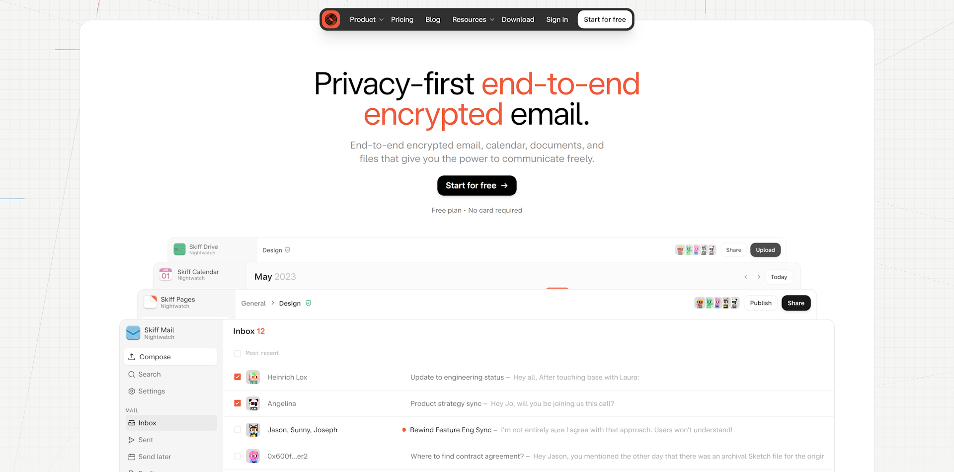
Why Skiff?
The navbar sits on top of the hero section, calling attention to it without being in the way
Everything sits in spaced-out cards which keep the page organized
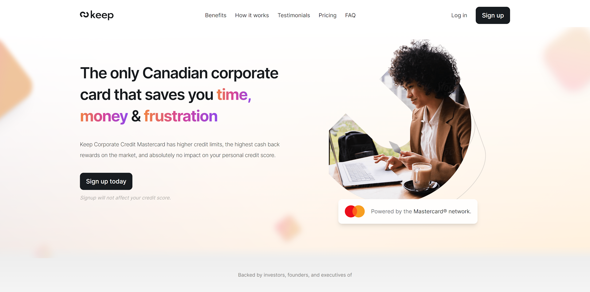
Why Keep?
Bold, colourful text gradients call attention to important words
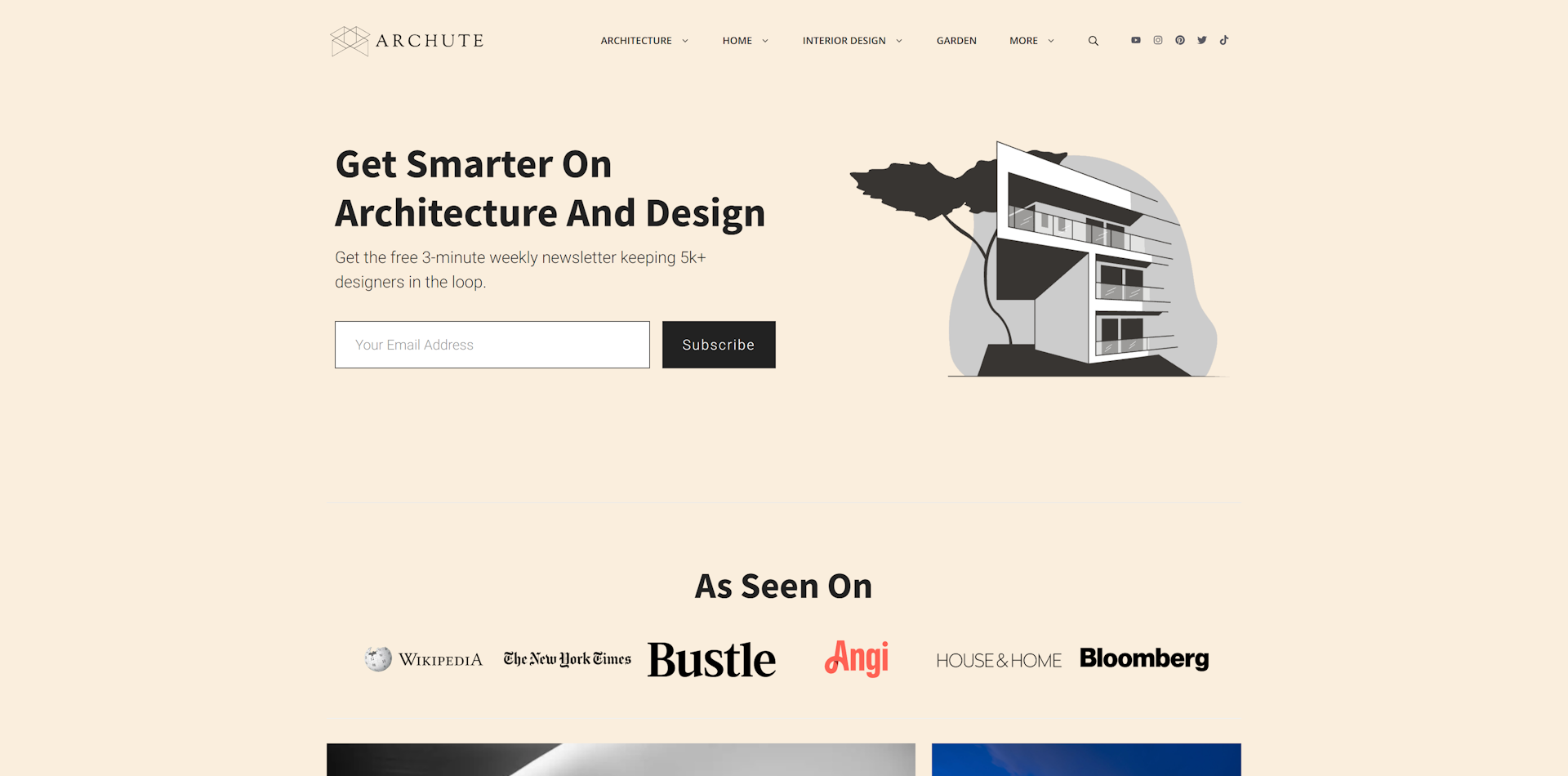
Why Archute?
The sharp edges in the illustration are consistent with the overall design language
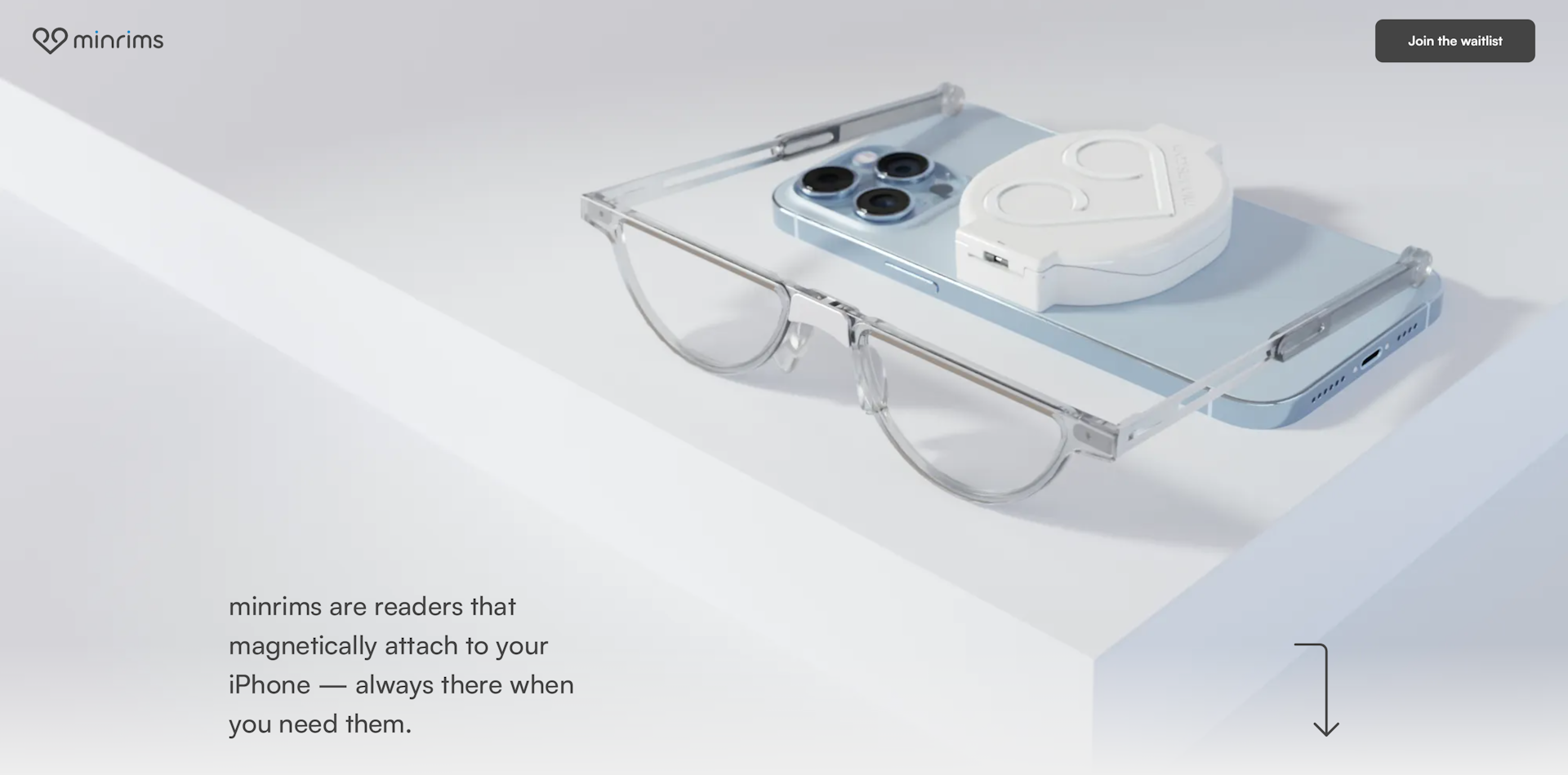
Why minrims?
Show don’t tell. The page allows the images to speak for themselves; communicating different aspects of the product.
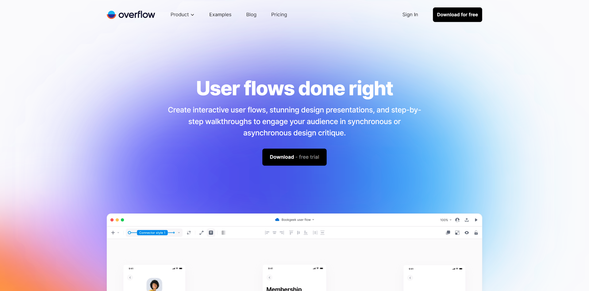
Why Overflow?
Using a colourful background gradient to call attention to the text
Their blog is very minimal, nothing unnecessary to distract away from the content