
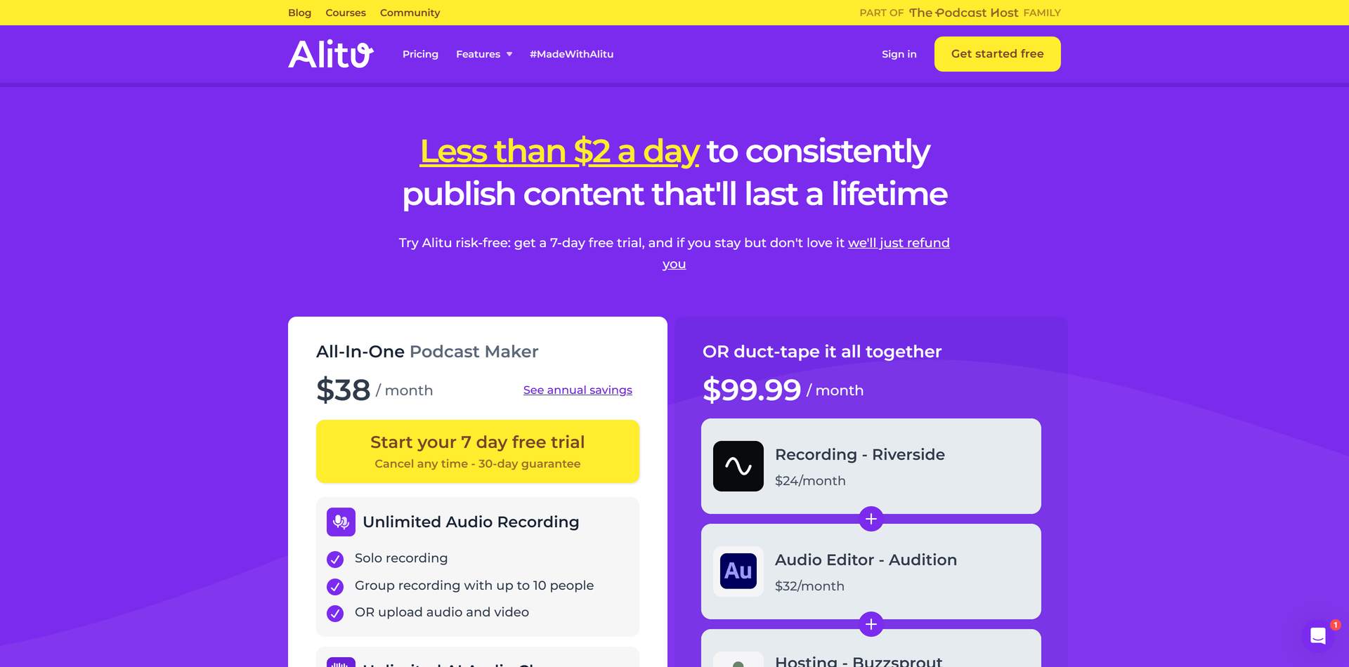
Why Alitu?
Visualizing how Alitu is an all-in-one solution that can replace a dozen expensive tools with just one is a great way to very quickly communicate value in a way that can be easily understood
Having a refund policy that goes past the trial period goes a long way toward reducing buyer risk
Showing a bunch of reviews from happy customers instills confidence in the product
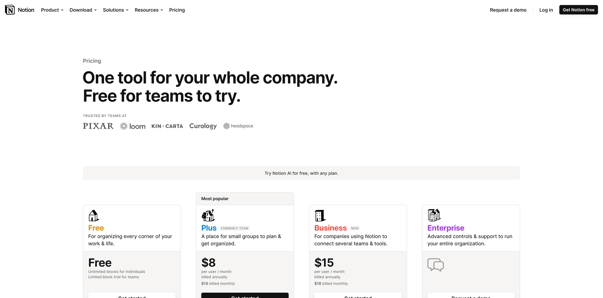
Why Notion?
Very standard structure with multiple plants. Familiarity means its more intuitive to visitors
Social proof right above the plans with logos of big companies instills confidence in the software
One plan is emphasized as being the "most popular" which helps nudge users in a certain direction
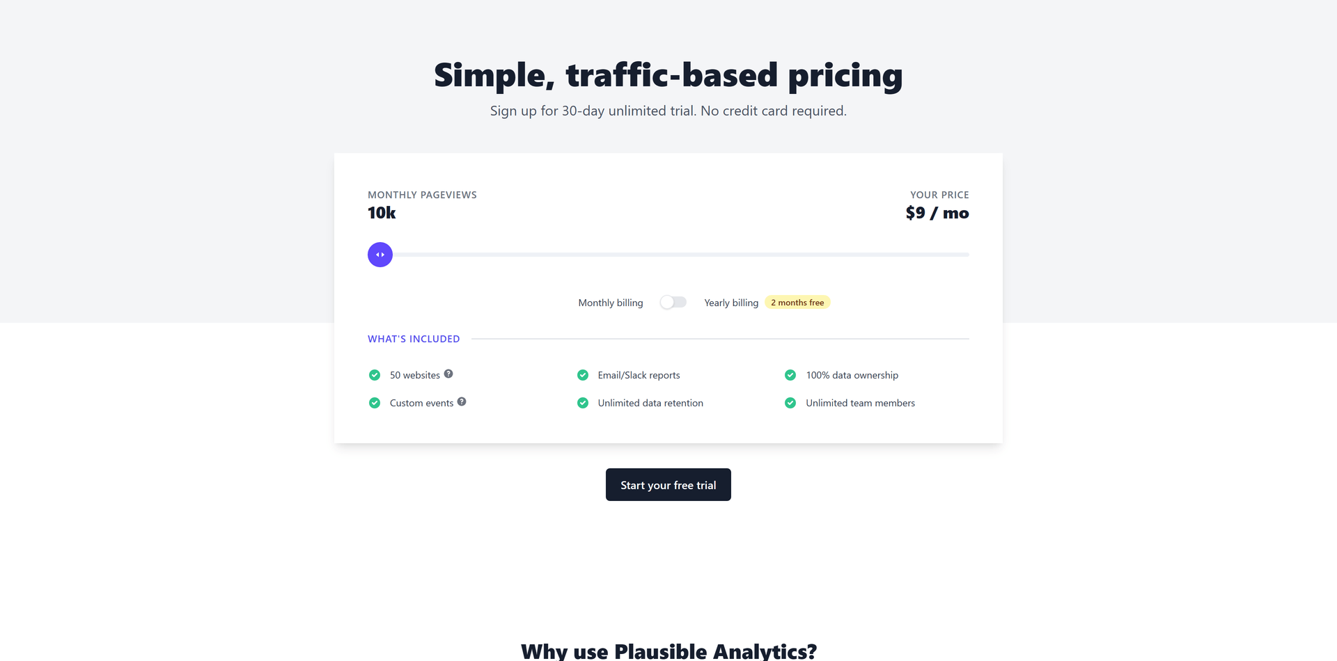
Why Plausible?
Granular pricing allows users to pay for exactly what they need instead of being confined by pre-made plans
"No credit card required" is an example of objection handling and reduces buyer hesitation
Showing what's included, even though it's regardless of chosen pricing, communicates value to the customer
Putting pricing in a section on the home page instead of on its own page allows users to naturally scroll to them
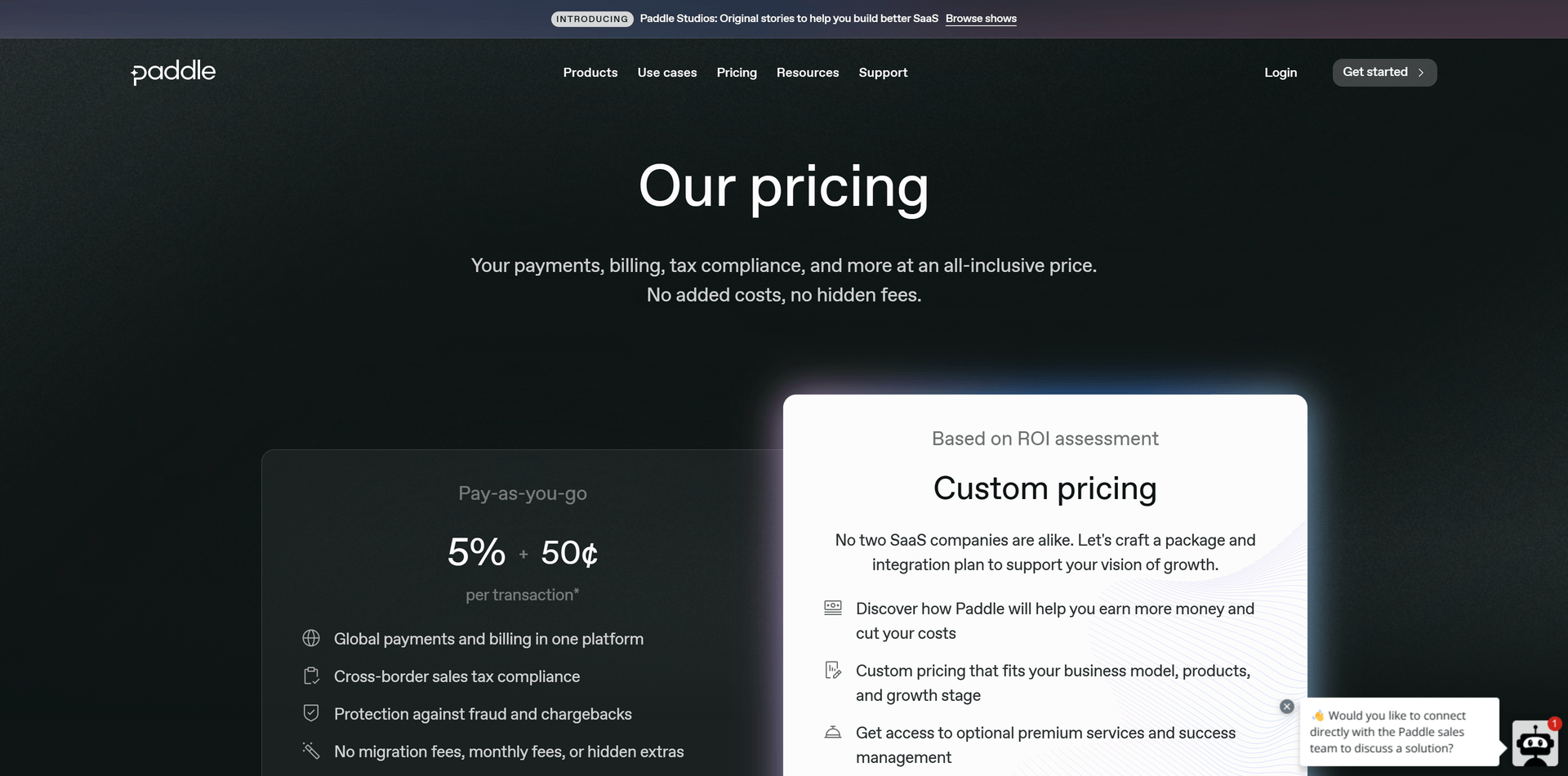
Why Paddle?
Very straightforward pricing and features
Only presenting two options takes advantage of Hicks's law (more options leads to harder decisions)
"No added costs, no hidden fees" is good objection handling
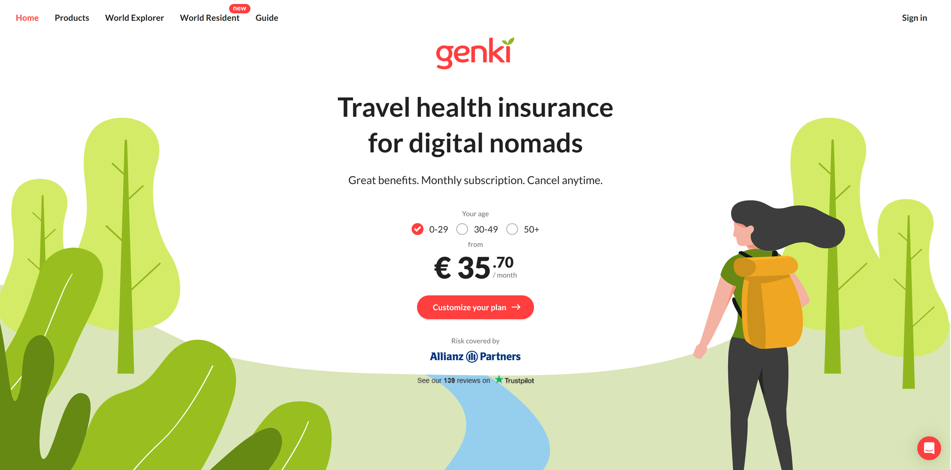
Why Genki?
Pricing is right at the top of the home page which reduces friction now that users don't have to go anywhere to find it
Putting the pricing customization behind a few simple options makes it easy for users to get started
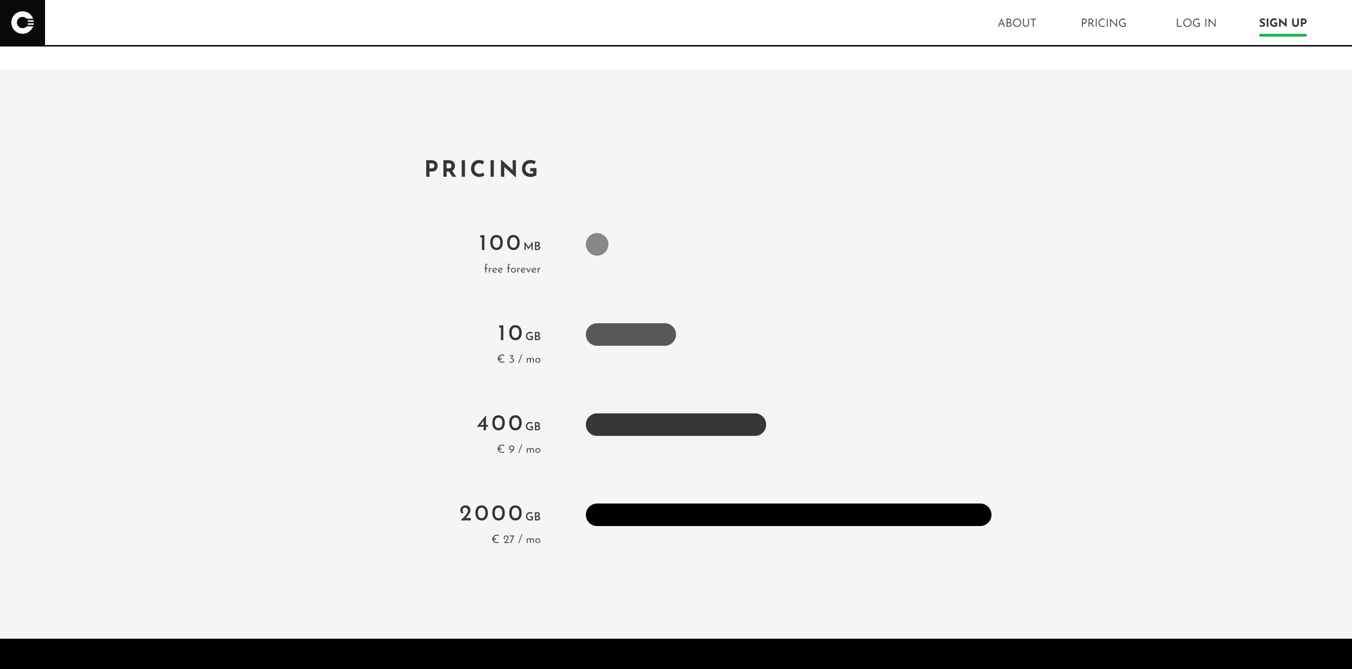
Why Cryptee?
This unique way to visualize the size of each offering makes it easier and faster for users to grasp their options
No fluff, doesn't get more straightforward than this. If your users have high buyer intent, this makes the decision easier
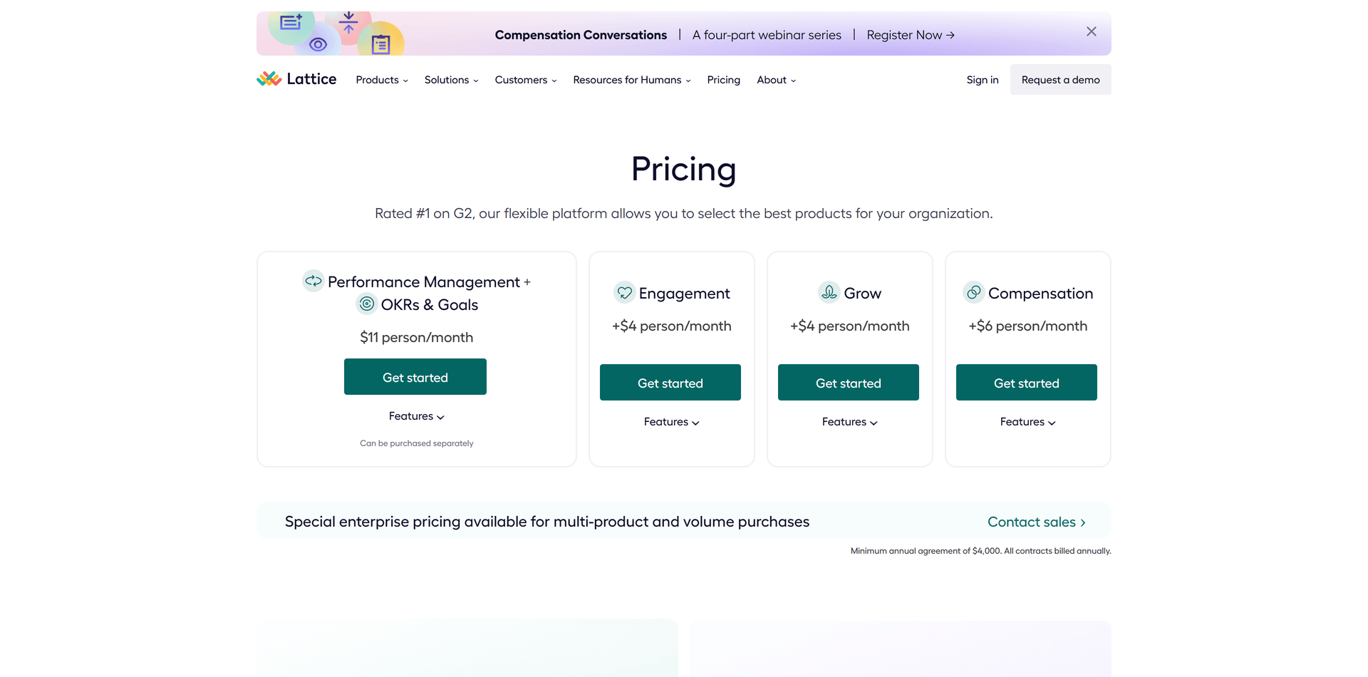
Why Lattice?
An example of price anchoring; the first price presented to users becomes their point of reference
By showing a more expensive plan first, the others seem cheaper in comparison
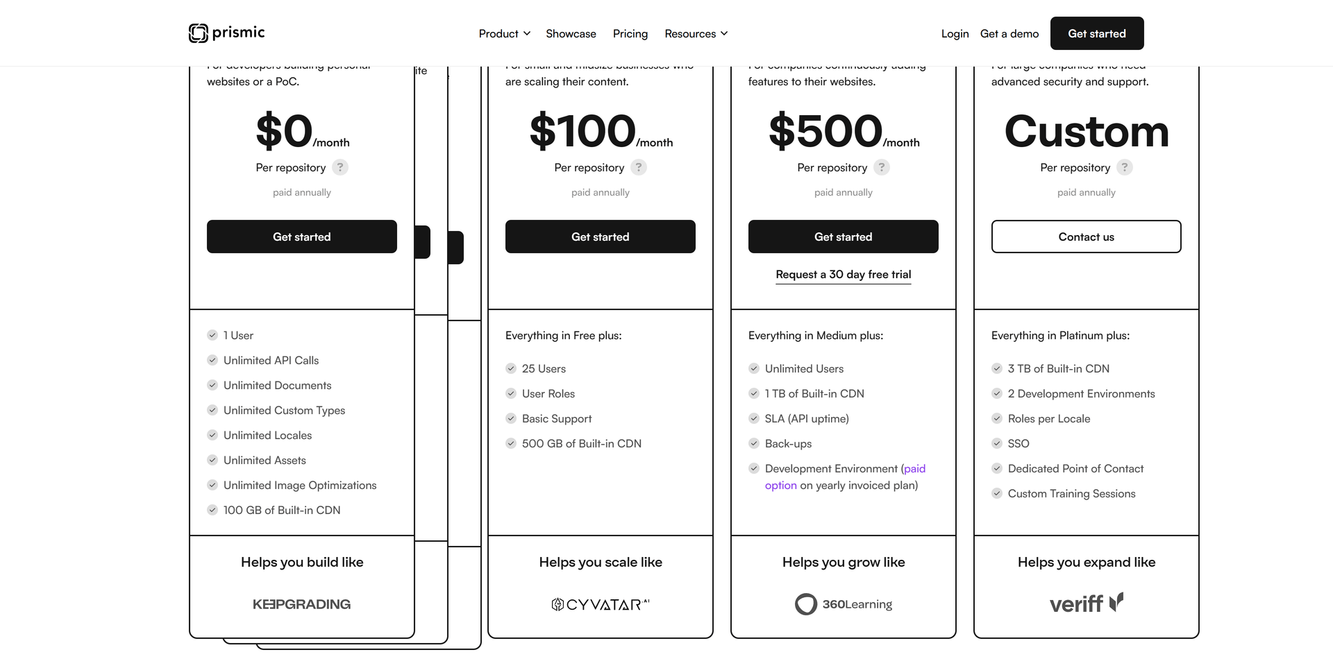
Why Prismic?
Rotating through logos of companies that use the plans is a great way to tie social proof into the specific offerings
Making the cheaper plans expandable under one option simplifies the initial choice